
File:Inequality and mortality in metro US.jpg
Summary
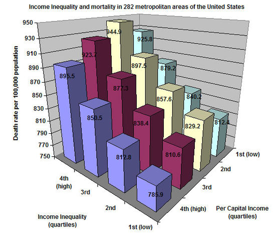
This shows death rates in metropolitan areas of the United States according to inequality of income and the average per capita income. This chart was created by Patrick Hayes using data from J. Lynch G.A. Kaplan, et al., "Income inequality and Mortality in Metropolitan Areas of the United States ," American Journal of Public Health 88 (1998): 1,074-80
I hereby release this image into the public domain.
Licensing
 |
I, the copyright holder of this work, hereby release it into the public domain. This applies worldwide. If this is not legally possible: |
 |
This is a candidate to be copied to Wikimedia Commons. Freely licensed or public domain media are more accessible to other Wikimedia projects if placed on Commons. Any user may perform this move—please see Moving images to the Commons for more information. Please thoroughly review the copyright status of this file and ensure that it is actually eligible for transfer to Commons. If you are concerned that this file could have problems with its attribution information and/or copyright status, then remove this notice and DO NOT transfer it to Commons. By transferring this file to Commons, you acknowledge you have read this message and are willing to accept any and all consequences for inappropriate transfers. Repeat violators will be blocked from editing. If you have checked the file and it is OK to move to Commons add "|human=username" to the template so other users can see it has been checked and can help you copy the file to Commons. If the file can't be moved to Commons consider nominating the file for deletion or changing the template to {{NotMovedToCommons|reason=Why it can't be copied to Commons}} If this image has been copied to Commons replace this tag with {{subst:ncd}} or {{subst:ncd|Image name on Commons.ext}} if a different filename is used on Commons. Copy to Commons: via CommonsHelper |
||
|
|||
File usage
Find out more
Learning is fun and easy with Schools Wikipedia. SOS Children works in 133 countries and territories across the globe, helps more than 62,000 children, and reaches over 2 million people in total. Why not try to find out more about sponsoring a child?