
File:Younis Khan Graph.png
Size of this preview: 640 × 373 pixels.
| |
This is a file from the Wikimedia Commons. Information from its description page there is shown below.
Commons is a freely licensed media file repository. You can help. |
Summary
| Description |
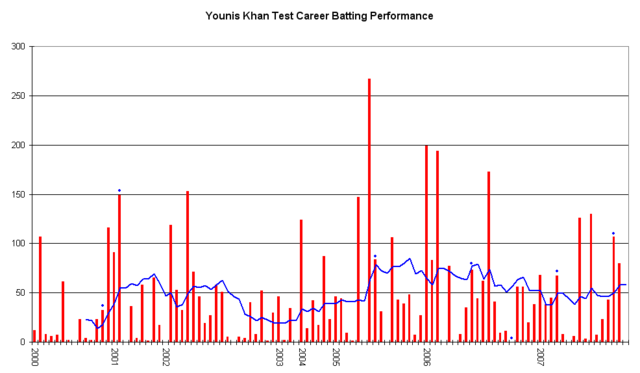
English: This graph details the Test Match performance of Younis Khan. It was created by Raven4x4x. The red bars indicate the player's test match innings, while the blue line shows the average of the ten most recent innings at that point. Note that this average cannot be calculated for the first nine innings. The blue dots indicate innings in which Younis finished not-out.
This graph was generated with Microsoft Excel 2002, using data from Cricinfo and Howstat .
|
| Date | 2 February 2006 (original upload date) |
| Source | Own work Transferred from en.wikipedia |
| Author | Raven4x4x at en.wikipedia |
Licensing:
 |
This work has been released into the public domain by its author, Raven4x4x at the wikipedia project. This applies worldwide. In case this is not legally possible: |
File usage
The following pages on Schools Wikipedia link to this image (list may be incomplete):
Did you know...?
Through Schools Wikipedia, SOS Childrens Villages has brought learning to children around the world. SOS Children works in 133 countries and territories across the globe, helps more than 62,000 children, and reaches over 2 million people in total. We have helped children in Africa for many years - you can help too...